Aratilis Memories
commissions , fine arts
02 Nov 2022
Greetings and well-met! It's been a while. I have a backlog of posts I want to write so let's start things off with this one:
This is something I worked on in September - an illustration commission for a relative who wanted a nice piece of art to decorate her home with. I did this one traditionally (for the most part) with watercolors and fineliners and assorted markers.
I scanned it before I sent it off, and tried to adjust the colors to look as close as possible to the original. My scanner's not the greatest though so just imagine the blues are less faded than they appear below.
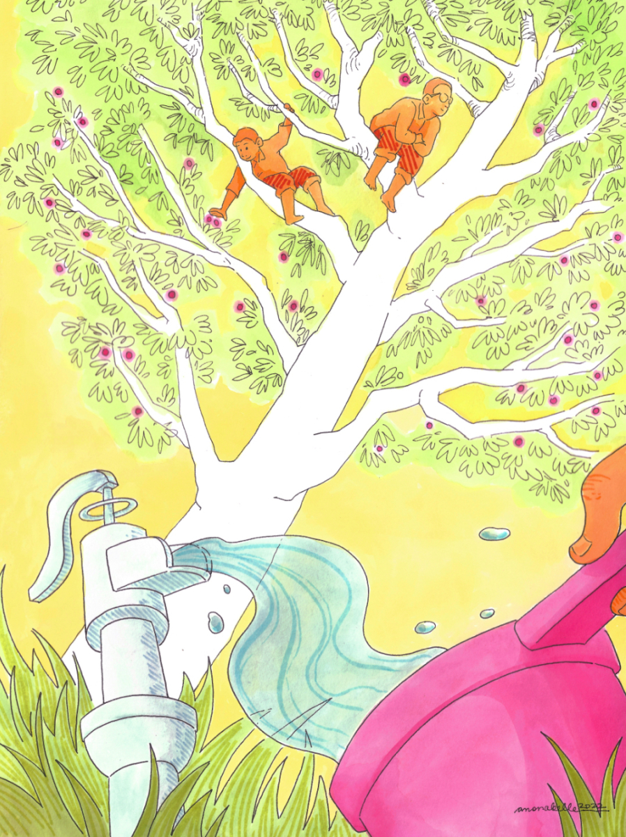
Aratilis Memories is a mixed media illustration created for Hazelle Luciano, based on imagery from her memories. It features her two children, Martin and Tristan, sitting high up in an aratilis tree laden with fruit, overlooking a water pump gushing water into a tabo. Colors used are predominantly warm and bright.
9 x 12" watercolor paper
Watercolors, pigment ink, alcohol markers, permanent markers
I've included some process images below! This one was interesting because I hopped between traditional and digital tools in between stages - something I avoid doing because it tends to be time-consuming. This piece didn't have a hard deadline so I figured that now was the time to experiment and see what new things there are to learn.
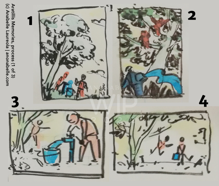
First, the thumbnail sketches, of which I did four in my sketchbook. The important elements of the piece are color coded for easier identification on the client's end (tree, running water, kids). I gave two portrait and two landscape options - number 2 won out, which was great because it also happened to be the one I was really liking as well.
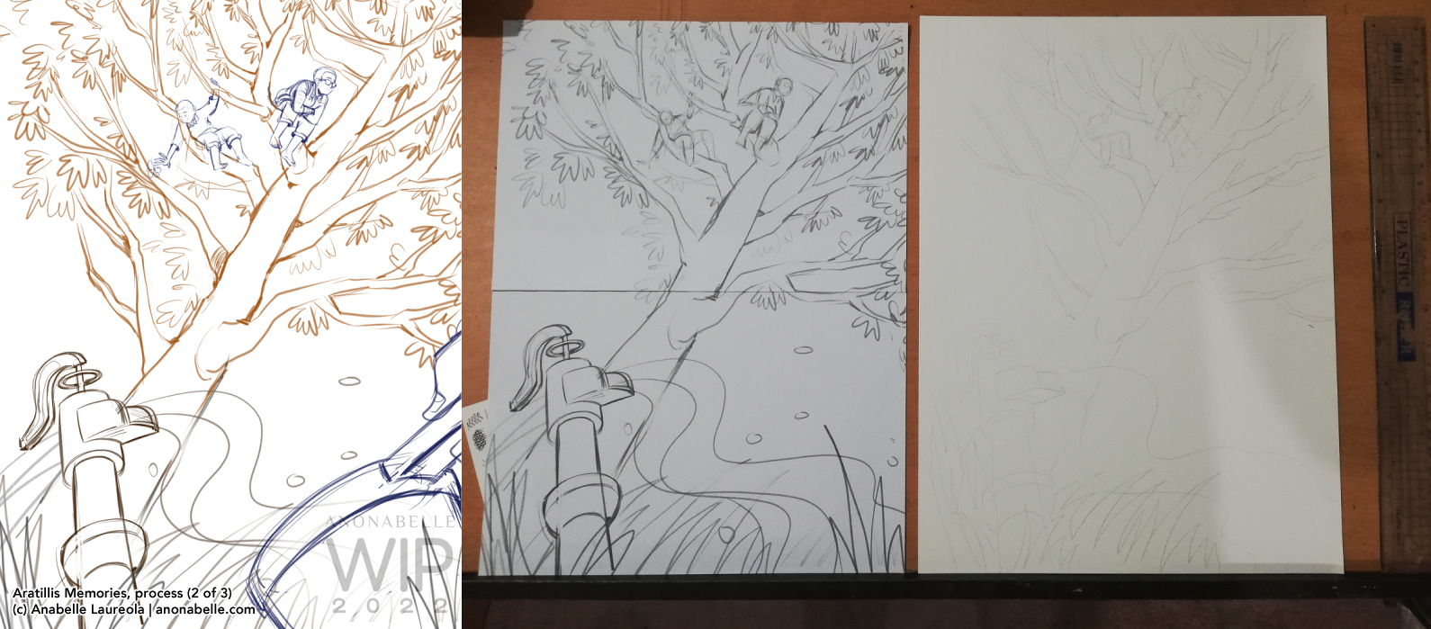
right: printed sketch transferred to watercolor paper
I'd read of some artists sketching digitally and then transferring that sketch to their paper via printer + lightbox, so I tried it out myself. Since the size of the piece is wider than what my printer can handle (9" width to my printer's 8.5" width), I printed on two pieces of copy paper and stuck them together. Worked out pretty well, I think!
I wanted to ink everything with my dip pen but feared the possibility that shaky hands would cause the ink to drip in unwanted places. So, unipin fineliners finished the line art this time around.
Another new thing I did in my process was to plan out my colors digitally before starting to paint. To do this, I took a photo of my line art (could have scanned it, but I wanted to be through with this part as fast as possible), cleaned it up (brightness/contrast tool ftw!) and just laid in blocks of color until I was satisfied with the combination.
This image (pictured below, to the right) served as my guide when I mixed my paints. It was such a relief to have it! It made the actual painting part of the process more relaxing; lessened my worries of "what if I choose a bad color combination".
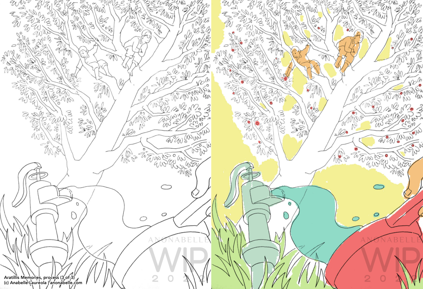
right: rough colors on lineart (digital)
It's been a while since I've worked on such a big illustration so this was such a refreshing experience! I definitely want to do more of this type of work so that I can streamline my process.
I did a few small studies on 2" squares of watercolor paper to prepare for painting this one - will talk about those in my next update.